Overview
Cart.com’s order management system re-design
After the acquiring other e-commerce businesses, Cart.com needed to support merchants with much higher order volumes. We re-designed the order management experience to empower new merchants to manage their business more efficiently.
Challenge
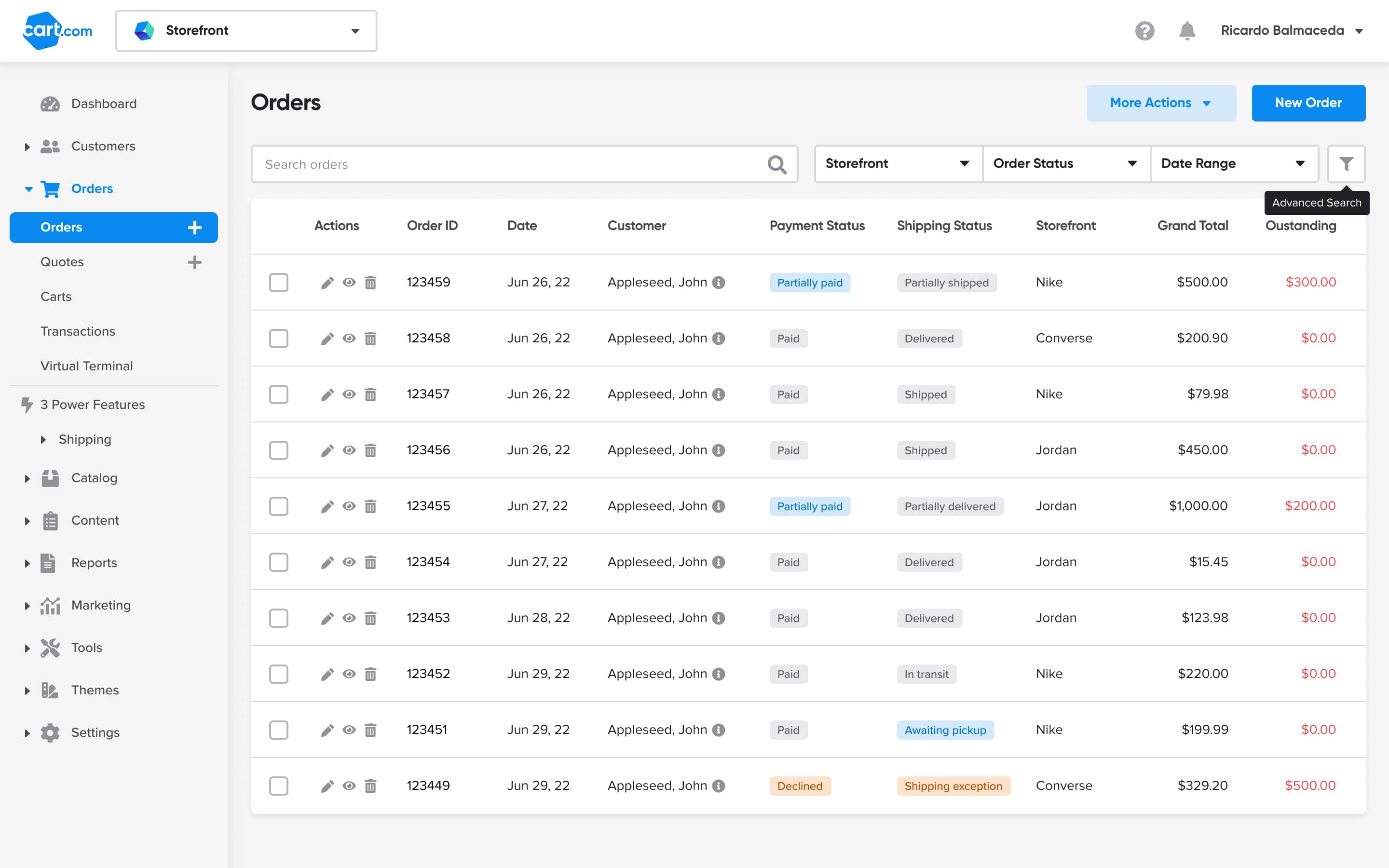
The Orders page is the entry point for merchants to begin managing their customer’s orders; it is one of the most-visited pages in the entire online store platform. Data showed that customers mostly used the Search function to manage single orders, which caused frustration since managing orders in bulk is more effective for the merchant.
Results
By surfacing the most relevant order filters, we saved users 15k - 20k clicks per month.
My Role
UI/UX Design, Research
Duration
Jun '22 to May '23
The work
1 Understand
The Orders page is the entry point for merchants to begin managing their customer’s orders; it is one of the most-visited pages in the entire online store platform. Data showed that customers mostly used the Search function to manage single orders, which caused frustration since managing orders in bulk is more effective for the merchant.
The merchant
Target businesses were SMBs with $200k - $5M in GMV.
User persona
The primary user was the do-it-all efficiency chaser who is highly involved in the daily operations of their business.
The problem
For the merchant
For users managing orders on our platform, prioritizing orders to fulfill is frustrating due to a poor order filtering experience. Instead, users search for individual orders which can be time consuming, especially as the business scales.
For our business
Offering a highly manual process for order management significantly hinders merchant fulfillment efforts, and as a result impedes the business from growing our shipping label service and potential key partnerships.
Device usage
When it comes to daily business operations, most of the time the efficiency chasers were doing the heavy work of order management via desktop. Mobile usage was important for checking alerts, or viewing order details one to two pages deep, but typically not further than that.

(past 90 days)
Data-driven approach
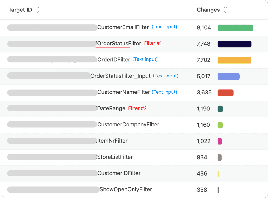
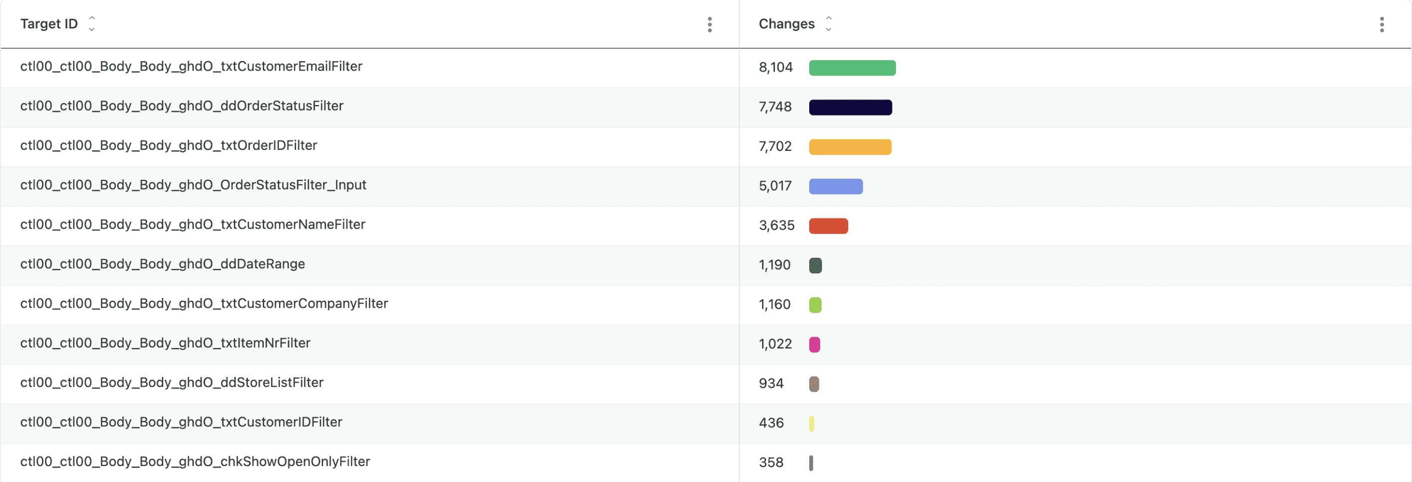
I worked with our Product Operations team to set up dashboards to collect data to determine the top filters (excluding text inputs) being used by merchants to find and manage orders; these were Order Status, Date range, and Store (not pictured in the metrics below).
Competitive landscape
Research involved noting competitor’s workflows to gain a deeper understanding of the key features for order management for SMBs, and specifically their filtering functions.
2 Ideate and validate
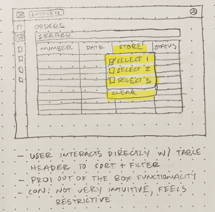
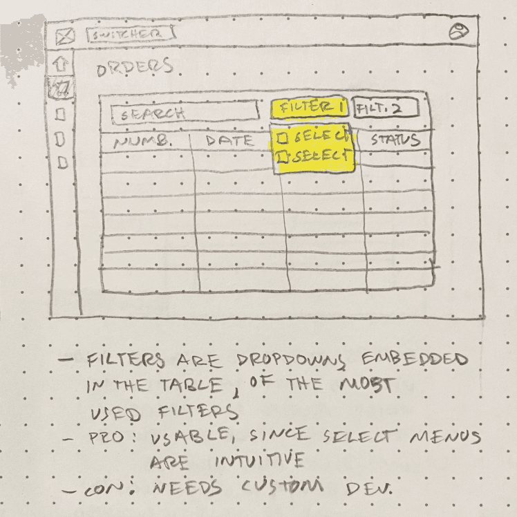
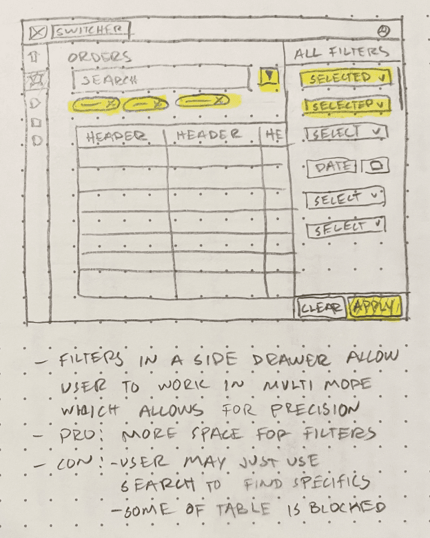
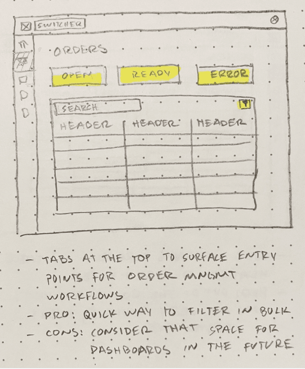
I sketched out concepts taking into account pre-built components from our design system, which were readily available and used design patterns that our users were accustomed to.
My PM, the design team, and I discussed the pros and cons of each design concept and quickly converged on an approach that used the search bar, 3 filters, and advanced filters.
Validate
With help from my PM, we recruited customers (merchants) and scheduled interviews to validate our thinking behind the filters we had surfaced, and either accept or reject our hypothesis: surfacing the top 3 filters from our filters menu will allow merchants to operate more efficiently i.e process more orders per day.
User feedback
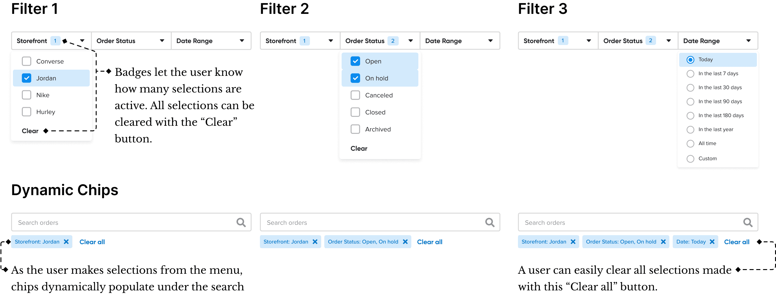
Users clearly understood how using the filters we surfaced would augment their order management process and using them in their workflow was intuitive. They had no difficulty understanding the Chips, Checkboxes, and Radio button functionality. The only questions raised were around the Custom Date Range filter, which were easily explained.
In cases where there are more than 4 filters selected, it feels too slow to remove the Chips to clear a user’s selections. Users wanted a way to use a single button to clear all of the Chips showing all active selections.
Most users don’t have multiple stores for their business so the Storefront filter wasn’t very useful to them. Instead, they suggested to show a Warehouse filter.
3 Design and Development
Before
In the old UIX, the user could search for orders via specific text entries, or filter them using this large menu of multi-selects, date pickers, and other components.
After
In the new experience, we surfaced the most used filters by the search bar, and re-designed the large menu into a side drawer that allowed users to see their data update as they searched.
Filtering details
We designed filtering components aligned with users' mental models, streamlining workflows and enabling faster access to relevant information.
Prototyping
I created a Figma prototype to demonstrate the UI interactions for the new order management experience, providing clear implementation guidance for engineers. The prototype effectively aligned PMs, engineers, and stakeholders, ensuring a cohesive design. Below are the key UIX elements I contributed to the final product.
4 Results
For the Merchant
Saved users 15k - 20k clicks per month in their order management workflows
Decreased frustration while managing orders, and increased user satisfaction
Shorter time to find relevant orders to ship or resolve errors
For the Cart.com
Successfully positioned Cart.com for the next milestone of our project:
to enable users to purchase shipping labels directly on our platform, and
to help effectuate key partnerships with major shipping carriers
5 Mobile
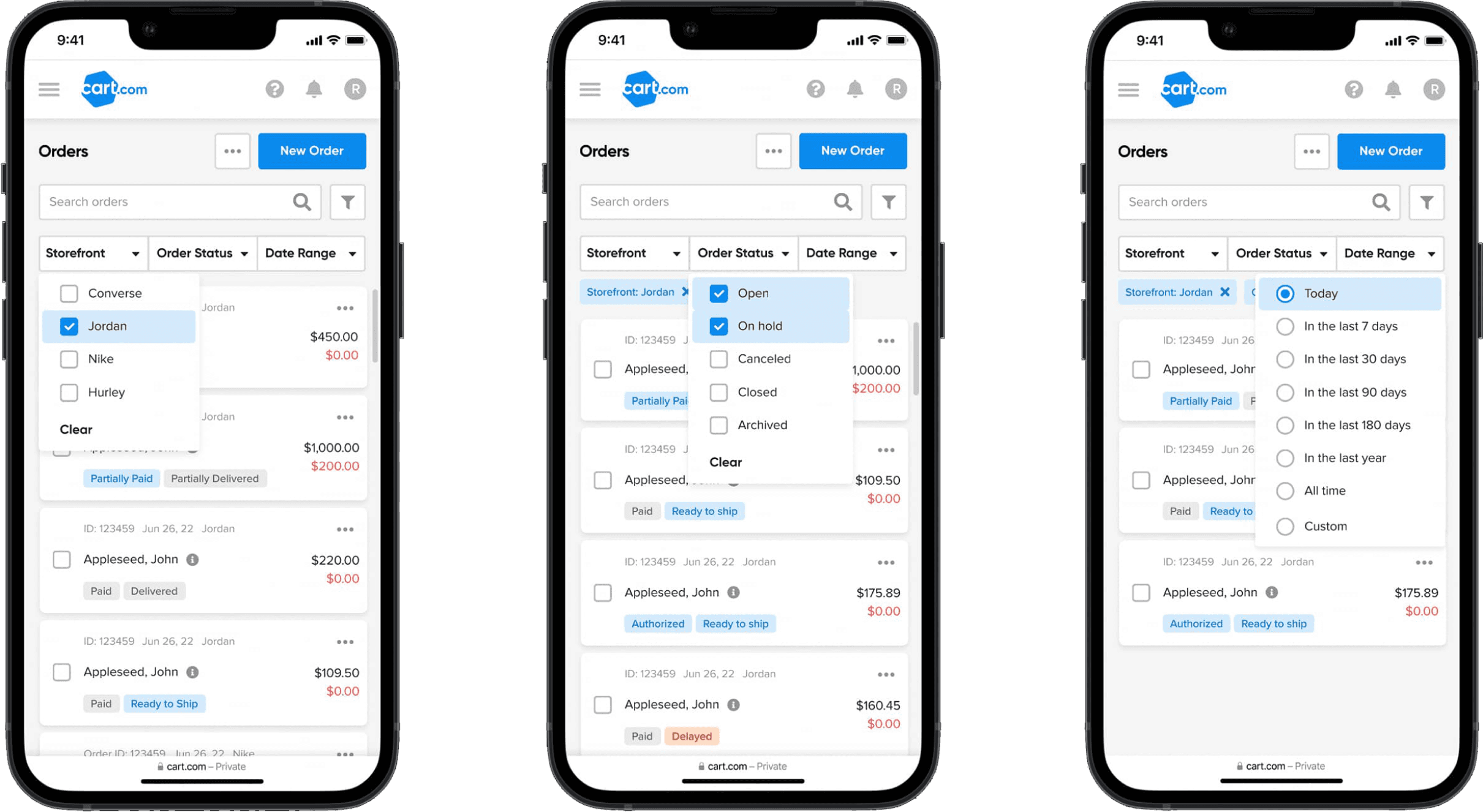
Our data showed that most users worked on desktop, likely because the mobile experience was limited and lacked responsiveness. While mobile mockups weren’t required for the launch, I took the initiative to design screens that reimagined the data grid as a card-based design. These mockups positioned us to validate and enhance the mobile experience as the product became more responsive.
Get in touch
